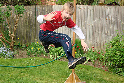
 Good picture composition is the starting point for creating visually compelling images. Aim to arrange different subjects and visual elements into a well balanced and attractive form within the picture frame.
The elements a photographer uses include lines, forms, textures, balance, symmetry, depth, colours, perspective, scale, and lighting.
Be spontaneous. The best way to improve your composition is to take lots of shots and develop the eye for a good picture. Here are a few basic principles that are really useful to have in the back of your mind when you frame your subject. Think of them as guidelines rather than rules that can never be broken.
Think creatively in picture composition.
Contents
Harmonise colour, brightness and contrast
Differences in brightness and colour create the boundaries between the objects in your picture. Colour harmony can be a matter of trial and error, but opposite colours, such as red and green, or blue and orange, usually complement each other. So, try to avoid colours that clash.
Excessively strong colour contrast may produce a vivid, but artificial effect. Subtle colour contrasts work better. Save the bright, dominant colour for the foreground or focal point so it draws interest. In black and white pictures, you have only one colour, so you must rely on differences in tone to create the shape boundaries between objects.


Identify your subject and its focal point
Some photographers will always attempt to put their subject at the centre of the picture. However, you can often achieve a more pleasing effect by placing the focal point elsewhere, but away from the extreme edges of your picture.


By cropping the left hand side of this picture, you move the subject to the left. This subconsciously emphasises her relationship with other people around the table. For a better understanding of where to place your subject, see Apply the Rule of Thirds below. Have a go at placing the subject in different parts of the image and discover which picture composition works best.
Apply the rule of thirds

Imagine two horizontal and two vertical lines drawn through your image. Like the gridlines on a noughts and crosses board, they break up your image into nine smaller rectangles. The best positions to place the main points of interest in your picture lie somewhere along these four lines.
Ideally, you should attempt to position your focal point on one of the four intersections of these lines. Experience shows that when you’re viewing a picture, your eyes usually go naturally to one of the intersection points rather than the centre.
Keep your subject in the upper third
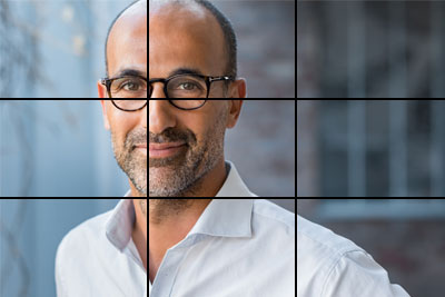
If you’re taking a portrait picture, run your subject’s eye level two thirds from the bottom of the image – in other words, somewhere along the top horizontal line. It’s the ideal spacing for a portrait. By applying the Rule of Thirds, you reinforce a person’s natural way of viewing an image, rather than undermining it. Try to keep this rule even if you’re going for a close-up and it means cutting off the very top of a person’s head.
When you photograph a still subject who is off-set, but not directly facing the camera, the greater part of the additional space should be in front of the subject.
Balance your main subject

Consider your subject matter in its context and its relation to the background. You can achieve a more striking picture by placing your main subject off-centre, as with the rule of thirds. However, this can leave a large void in the background. Fill the empty space by positioning another less conspicuous object asymmetrically – the mountains and trees in this picture. These will restore the balance. Avoid letting the additional object dominate the picture. This will stop it taking too much attention away from the subject.
Use lines
When you look at a photo your eye is naturally drawn along a line. Lines can lead you to your subject. Bear in mind that any line used in a picture is at its most effective when it originates outside the frame and leads your eye to the focal point. These are called leading lines.
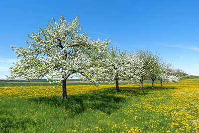
Lines also add creative interest. They can affect the way you view the picture, taking you on a journey into the scene itself. Lines can be straight, zigzag, radial or curvy. Discover how pathways, roads, rivers or railways can add crucial lines to your picture. Also consider buildings, doorways or even shadows as means of providing eye-catching lines. Brickwork can make an excellent background for a portrait. See how the row of trees in the picture below give interesting diagonal lines.
Horizontal and vertical lines give a strong structure to your shots. A meandering curved line sends out a more relaxed feeling.

Use diagonal lines
Make your picture livelier by setting your subject matter on a diagonal. This works well for many subjects, especially landscape pictures. Diagonals accentuate the perspective and depth of the picture. Linear elements, such as roads, waterways, and fences, are generally perceived as being more dynamic when placed diagonally, rather than horizontally. However, there’s one exception. It’s best to keep the natural horizon level otherwise your shots may appear skewed.
Frame to enhance your subject

Look out for objects that make ideal natural frames. Use them. Doorways, windows, pillars, arches, each can be brought into play creatively to frame your subject and heighten its visual appeal. Almost anything can be a frame in your picture composition. For outdoor photographers, a bridge is an ideal example of a good framing element.
Don’t remove interesting surroundings. If you’re taking pictures in a rural setting, try including a tree or branch in the foreground. Place it at the edge of your composition, above and to the side of your main subject. The result is a more focused image that draws your eye towards the main point of interest. A frame emphasises your subject without distracting from it or taking away focus.
Symmetry catches the eye
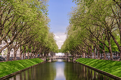
We are surrounded by symmetry and patterns, both natural and man-made. They can make an eye-catching composition, particularly in situations where they are unexpected. A symmetrical shot with a strong point of interest can make a striking image.
Another great way to use this is to break the pattern in some way, bringing tension into play and adding a focal point to the scene. Without the good point of interest symmetry can be rather predictable.
Create texture

Some backgrounds can be garish and distracting. If you can’t easily eliminate your backdrop, why not use it imaginatively to your advantage? You can draw your subject away from it and shoot on a wider aperture and shorter exposure to reduce the depth of field. Focus manually on your subject which will come out clear and sharply defined against a blurred background. The human eye naturally seeks out the elements that are in focus. This method allows for artistic texture without completely removing the creative interest of the wider shot.
Choose your viewpoint carefully

Your viewpoint has a massive impact on your picture composition. So, before photographing your subject, take time to think about where you will shoot it from. Instead of simply taking your picture from eye level, try to find unusual angles by changing your position. Question whether you want to be a long way from your subject, or close up. Consider positioning yourself higher or lower, down at ground level, from the side or from the back. Don’t shoot everything standing up.
Sometimes getting rid of a distraction is simply a matter of moving your camera to another place. Often a small movement is enough to completely eliminate a distracting tree branch or a lamppost that appears to be growing out of someone’s head.
Watch the background
A busy backdrop will detract attention from the subject of your picture. Avoid loud and contrasting colours, overexposed or exceptionally bright areas, and unsightly objects. All these pull the eye away from your intended subject. The focal point is overshadowed by all the noise taking place behind it. And so, your image lacks impact.
You can overcome this problem at the time of shooting. Search for a suitable background, preferably one which is plain and unobtrusive. Failing that, throw the background out of focus.
If you’re working on portraits, keep the backdrop plain and simple. Make sure there are no unwanted items that appear to stick out from your subject – unless, of course, it adds to the shot.


Create depth

Photography is a two-dimensional medium. The camera tends to flatten the foreground and background. So be aware of losing the sense of depth that was obvious in the original three-dimensional scene.
One way to overcome this is to include various objects in the foreground, middle ground and background of your image. Try overlapping several of these with others further away which you can partially obscure. The human eye can then mentally distinguish the different layers and separate them out naturally. This draws the observer’s attention towards the foreground subject and away from the water and buildings in the background.
Nature is one of the best artists. There are many natural scenes which just happen to obey the rules. Just grab the opportunity!
And finally, don’t be a slave to the rule book

Photographic rules are meant to be broken. They are guidelines, not tramlines. Once you’re aware of them, take a risk and don’t be afraid to ignore them if you think you have something better.
Be open-minded. There are times when breaking the rules is precisely what makes your picture stand out from all the rest.
As the artist Pablo Picasso said, “Learn the rules like a pro, so you can break them like an artist.”
What works for one photo won’t necessarily work for another. Digital photography enables you to experiment with different compositions until you find the perfect one. Keep smiling and keep clicking.
You may also find my article on news values of interest.
Back to home page
